Chimera Fest

For this project, I wanted to experiment with creating visuals for a massive music festival. Being an enormous music lover myself, it sounded extremely fun to design event collateral! As I started conceptualizing, I quickly realized that the best way to express the emotions I feel towards music would be to invent and imagine a music festival of my own rather than creating design collateral for an existing festival. Thus Chimera Fest was born!

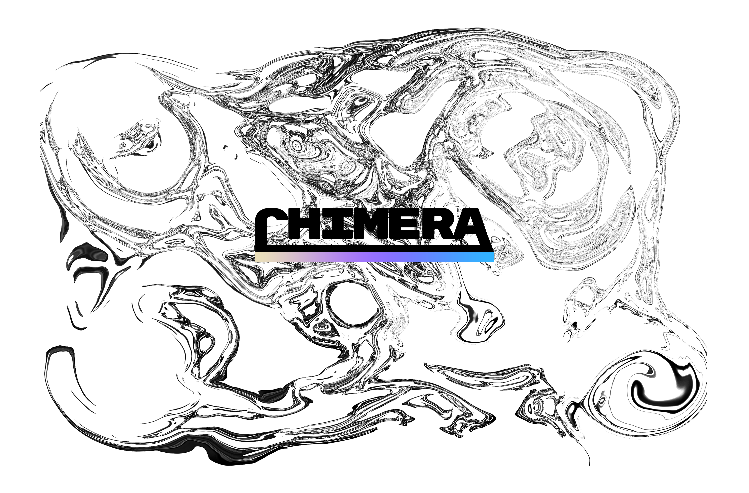
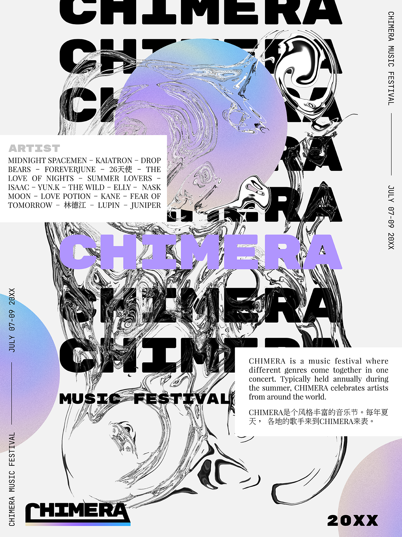
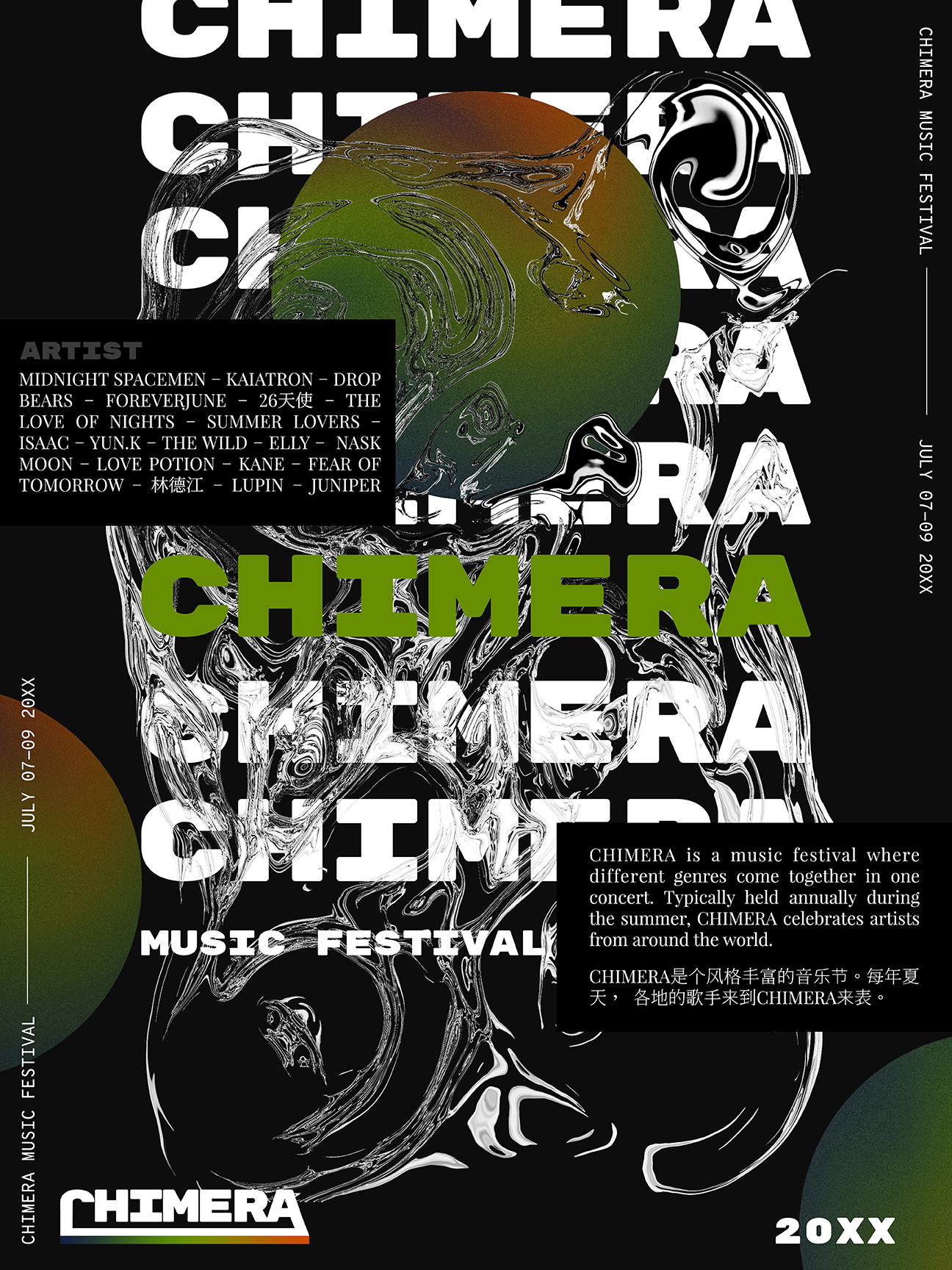
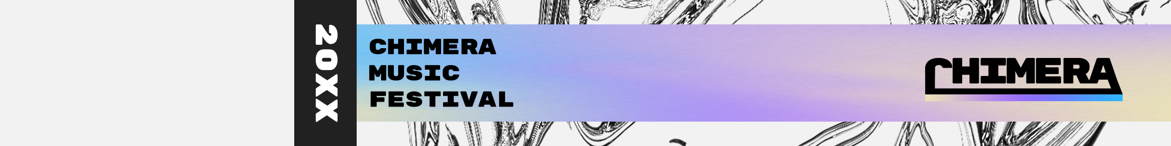
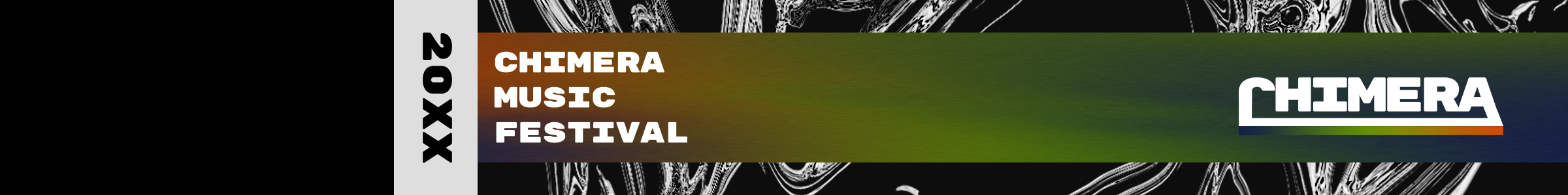
I wanted a festival that expressed the movement and fluidity of music. Music can be as light as you want it, but also as dark as you want it. It can be free and loud but also small, comforting and quiet. I love how music can guide you through your highest of highs as well as your lowest of lows (and every single emotion in between). For Chimera Fest’s visuals, I wanted to focus on this ever-changing and free-flowing emotional relationship we have with music.

Logo
Let’s talk logo! For the logo, I went with something that was edgy but also playful. I decided on sharper and bolder shapes to have a heavier impact on the viewer. I wanted something strong that made the festival feel like it was a movement of some kind. I contrasted the weight of these shapes with lighter and fun color gradients.

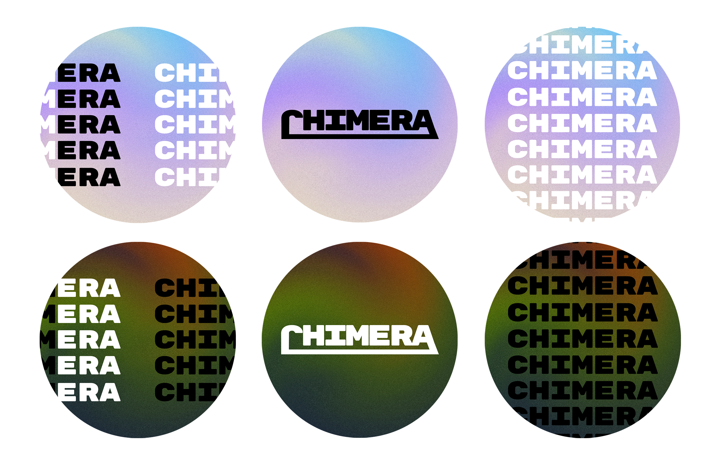
Lastly, the connection between the first and last letters of the logo is very important to me. I wanted to showcase the word the festival was named after: Chimera. The name Chimera made a lot of sense to me when I was brainstorming names for the festival. Rather than the festival being a three-headed fire-breathing monster (which it could be musically!), the word represents a place where different music genres and styles come together.
Main Logo
Logo Variation
Typography
Hmmm… An event and identity that revolves around the amalgamation of music styles as well as the fluidity and ever-changing relationship we have with music. With this in mind, I decided to have a very strong uppercase font contrasted with a more elegant and airy font!

Rubik Mono One would mostly be used for big lettering and headlines where Playfair Display will be used for body text and writing.
Main Font
Paragraph Font
Color
Color is a factor that I had a lot of fun playing around with. I decided to make a color palette that featured three colors to reflect chimeras (chimeras being three-headed monsters). For the main color scheme, I wanted something light and elegant that could cut the edginess and heaviness of the logo. Similar to how one might eat pickled radish with fried chicken as the sourness of the radish cuts the heaviness of the chicken. I wanted to create this type of tension within the branding to show the mutating characteristic of music. I opted for dreamy and flowing pale oceanic colors to contrast with the robustness.

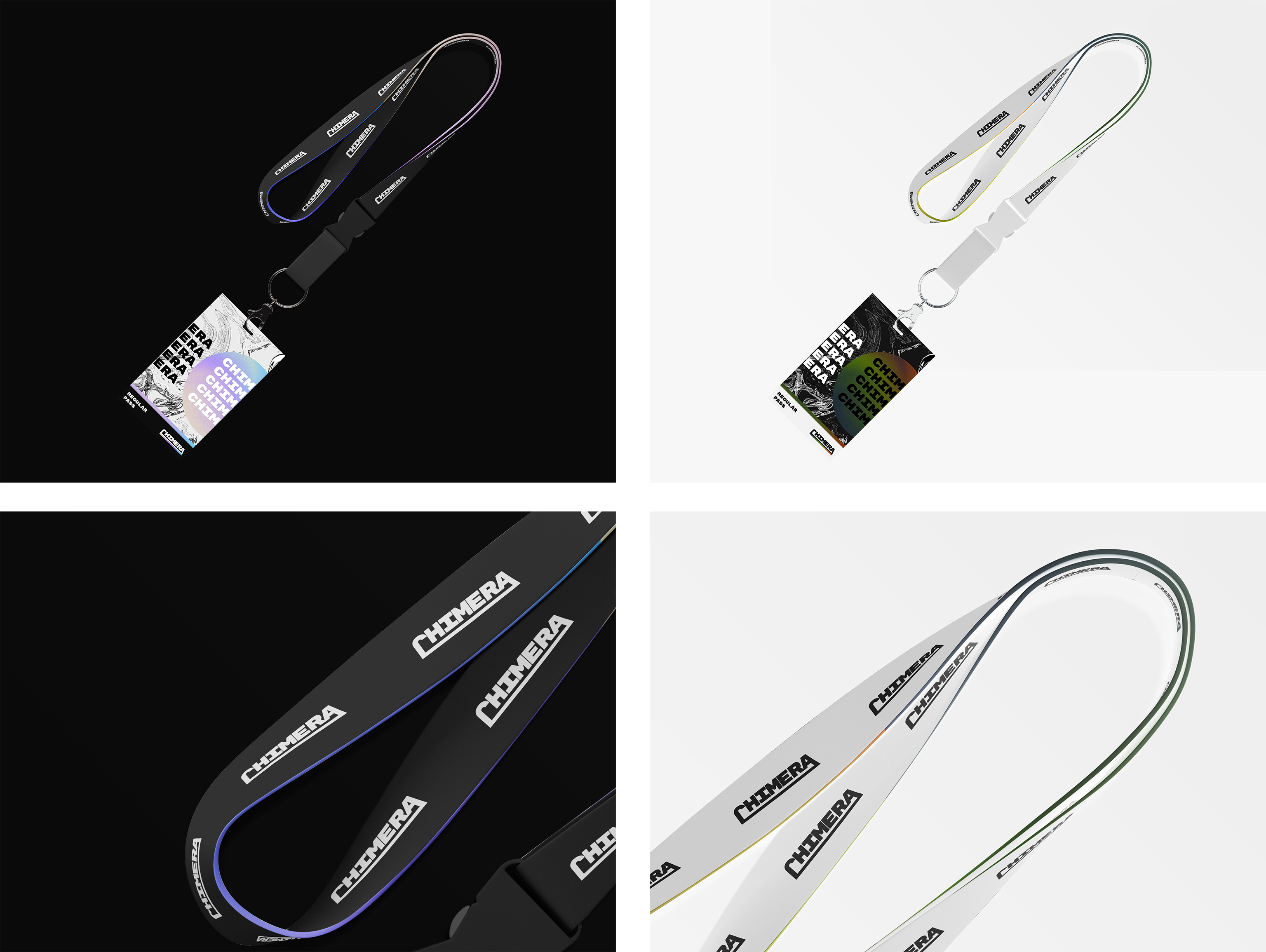
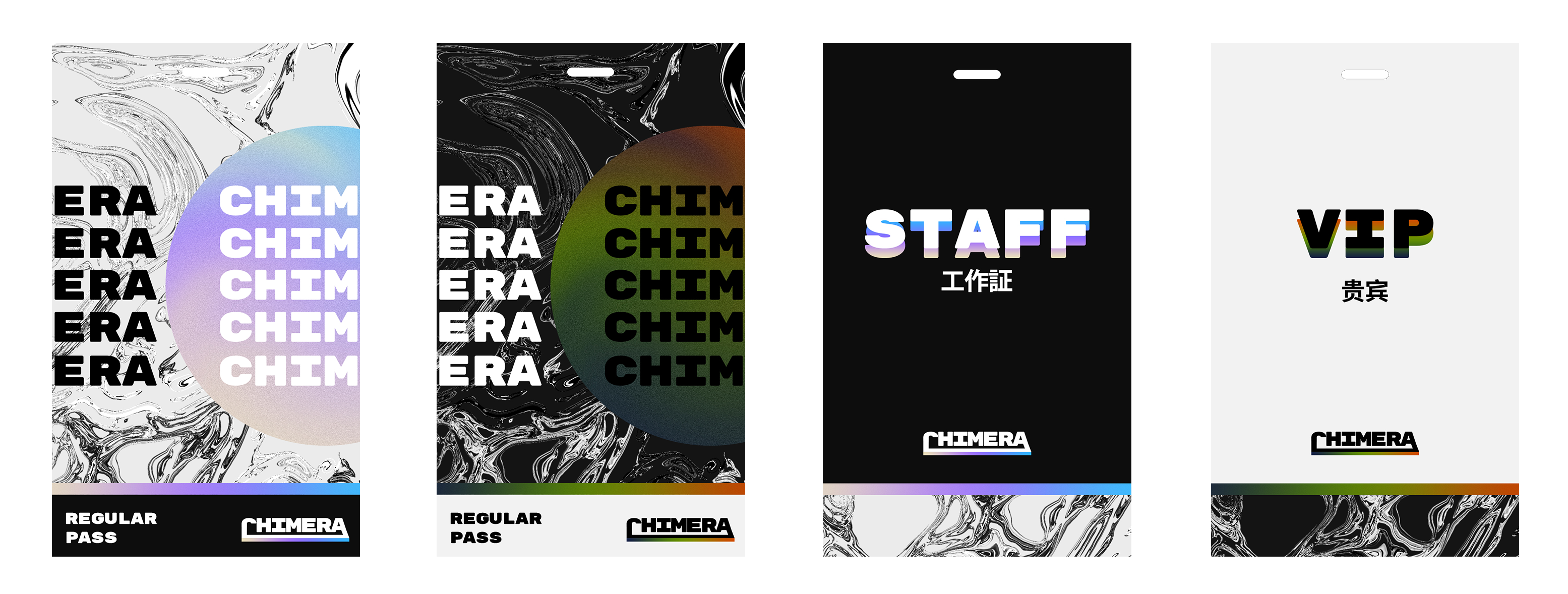
I also decided to have an alternate color scheme. This was to showcase the different sides of music (light and dark). For the second color scheme I went with the total opposite of the main color scheme (quite literally as these are the inversed colors of the main color scheme). I went with something more reminiscent to what color nightmares and night skies would be. These colors will be used with a white colored version of the logo to keep that radish/fried chicken relationship I mentioned earlier. Anyone else getting hungry here? Just me?... Alright moving on...
Main Color Scheme
Alternate Color Scheme
Posters
Let’s talk posters and get into the graphic creations for the festival! Needless to say, by now we’re quite familiar with the theme and personality of the festival. I wanted the poster to reflect the fluidity, the movement, the elegance, the playfulness and the robust heaviness contrasted with the light airiness.

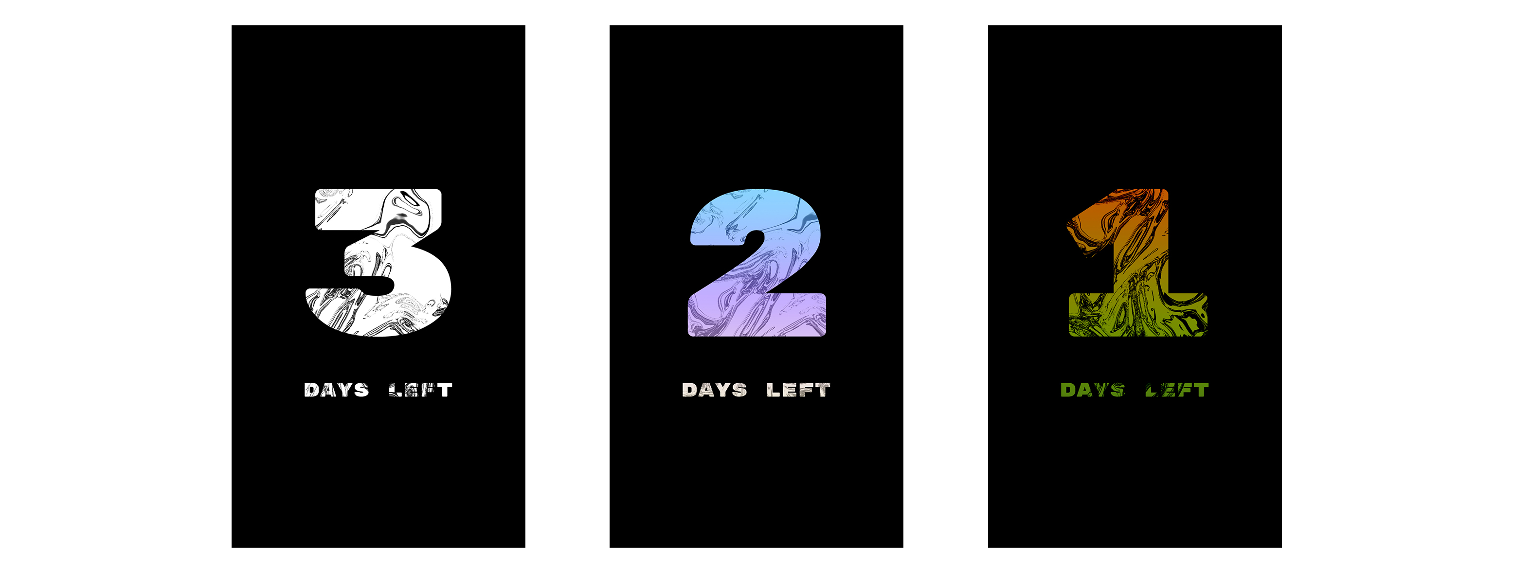
This led to creating one of the key visuals of the festival: the metallic liquid texture. The moment I rendered the final version of it, I knew it fit perfectly with the festival. It quite literally represented the fluidity of music. The idea of liquefied metal displayed the tension between strong and mellow so fittingly. The texture was created by warping and distorting an image again and again until it became translucent. I played with filters and lighting to give it a more metallic shine and feel.
Additional Material
Below we have the rest of the little graphic elements that make up the visuals of the festival. Each of them features a light version as well as a dark version and embraces the thematics of the festival.
Lanyards
The lanyards were really fun to design. I instantly knew I wanted a full black lanyard because of how they look. They fit the color scheme so well and I just think they’re so cool! I started there and made a white colored version to fit the alternate color scheme. A fun idea I incorporated was to have the edges of the lanyard be lined with a color gradient. I found that this echoed the branding and logo very well.
Badges & Passes
Wristbands
Stickers
Promotional Teasers
Lastly, we have some of the teasers that were posted on Instagram leading up to the release! The project was released in parts through February 19 - 21. Each day I revealed more and more about the visuals and concept for the project as well as include a Spotify Playlist for each of the days of Chimera Fest to give it that virtual concert feel. Each playlist featured 50 songs and 10 artists of various genres.